

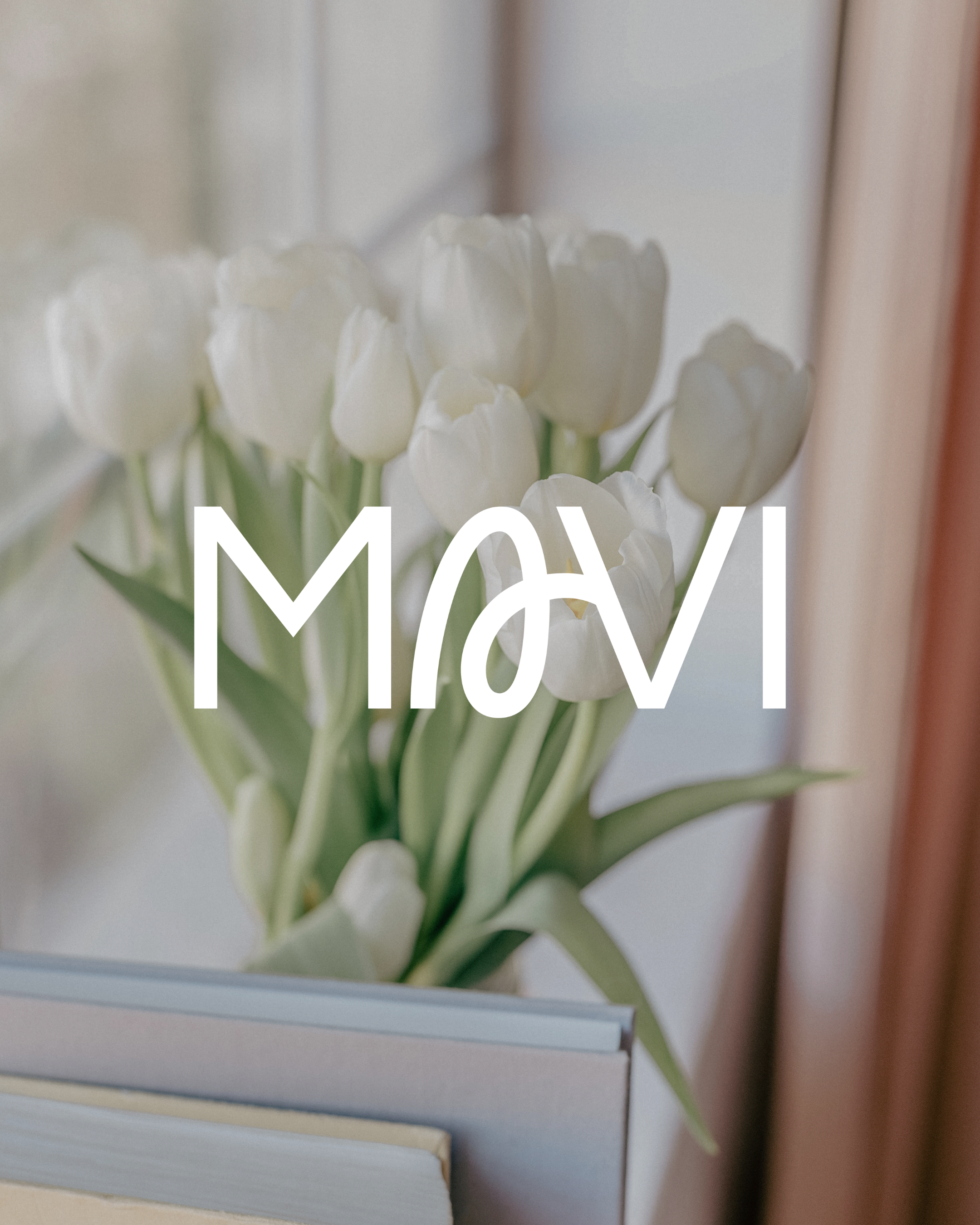
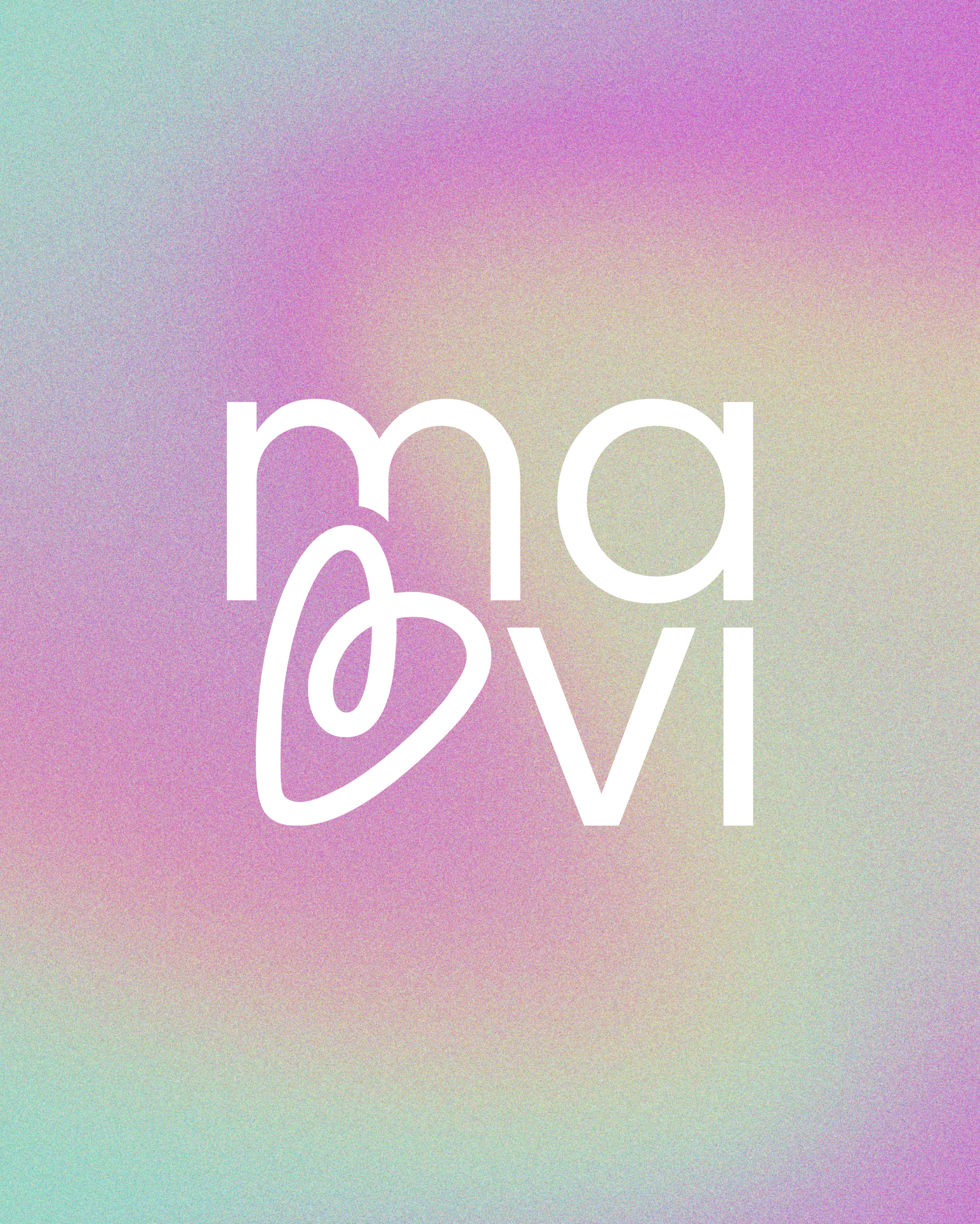
Mavi
Brand Identity
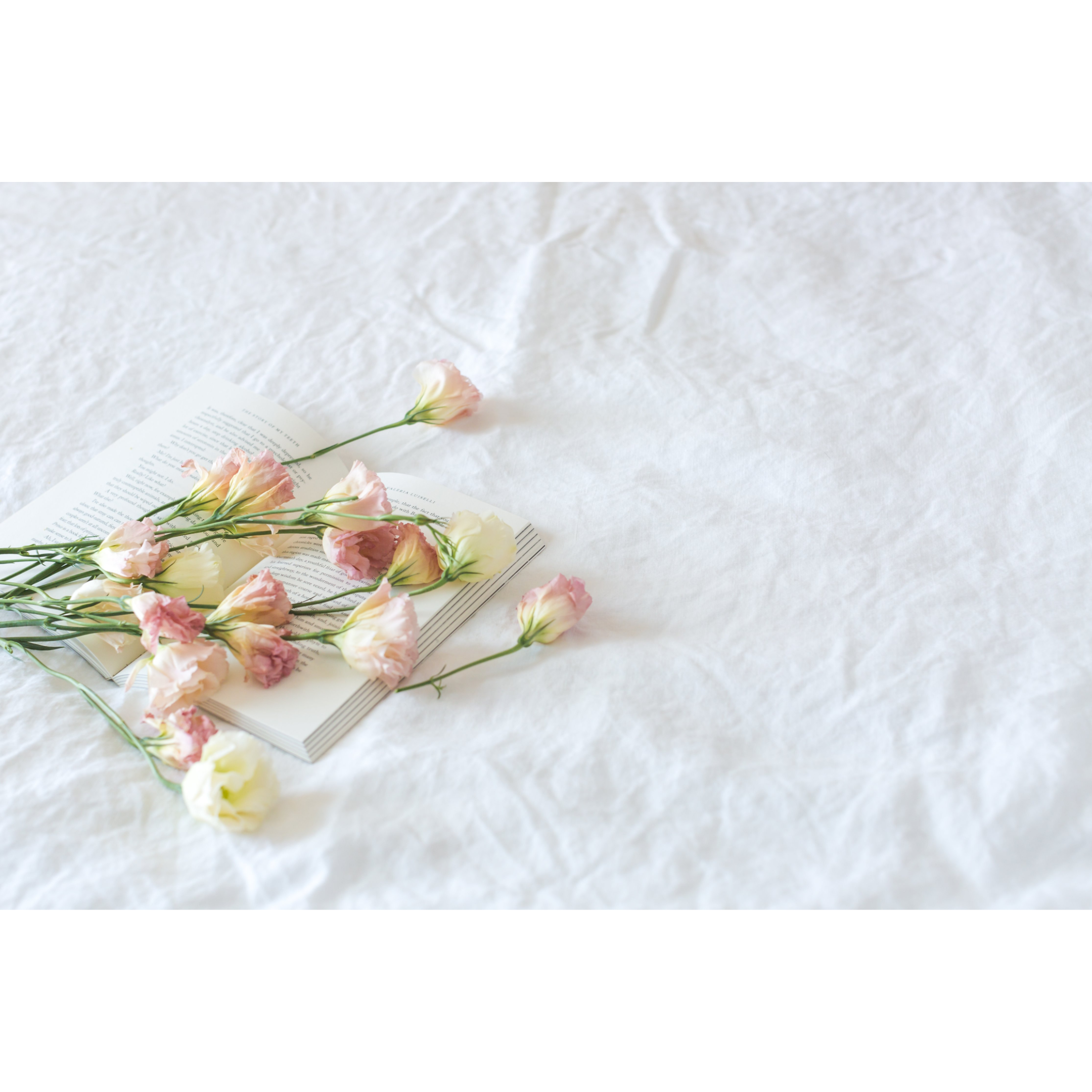
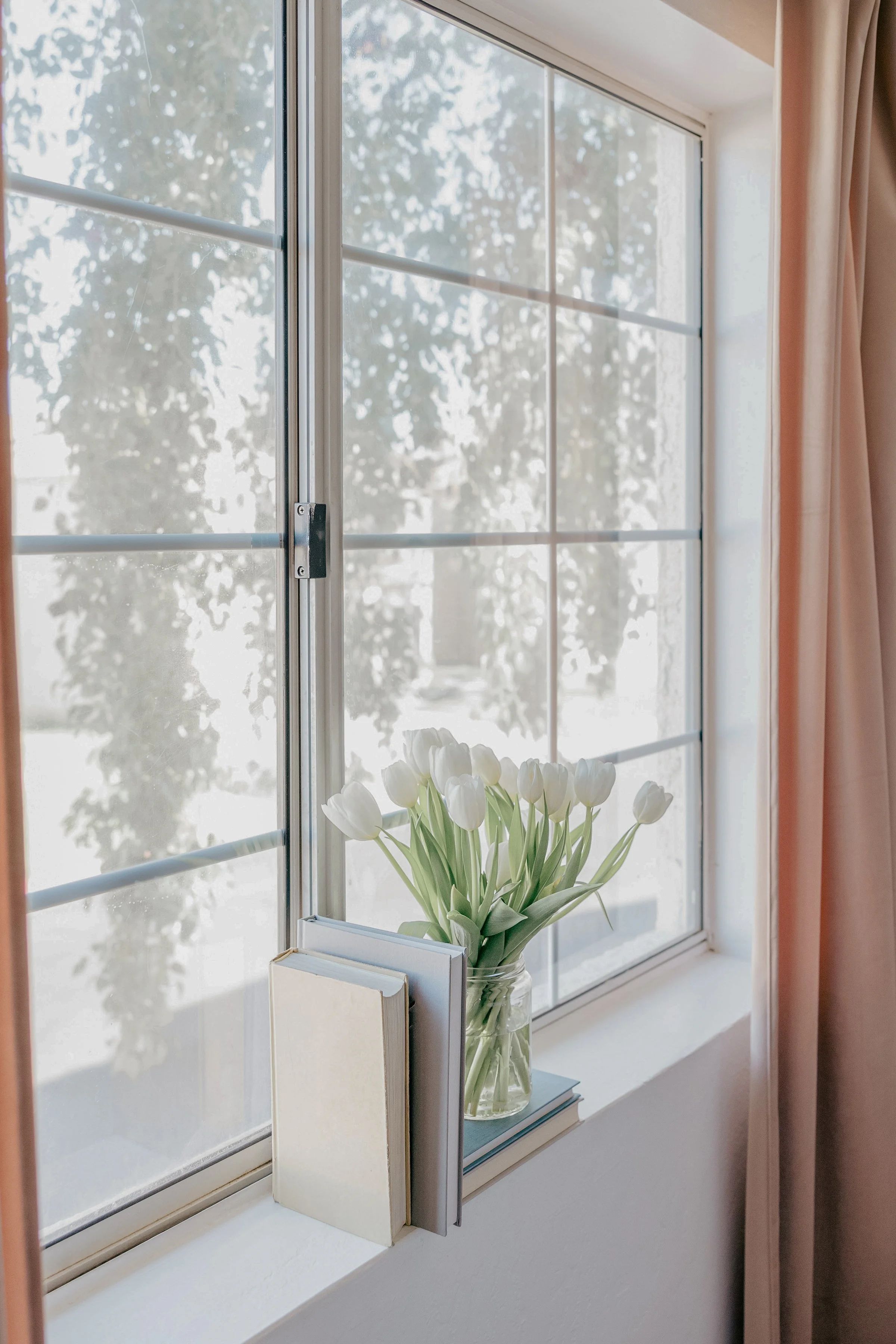
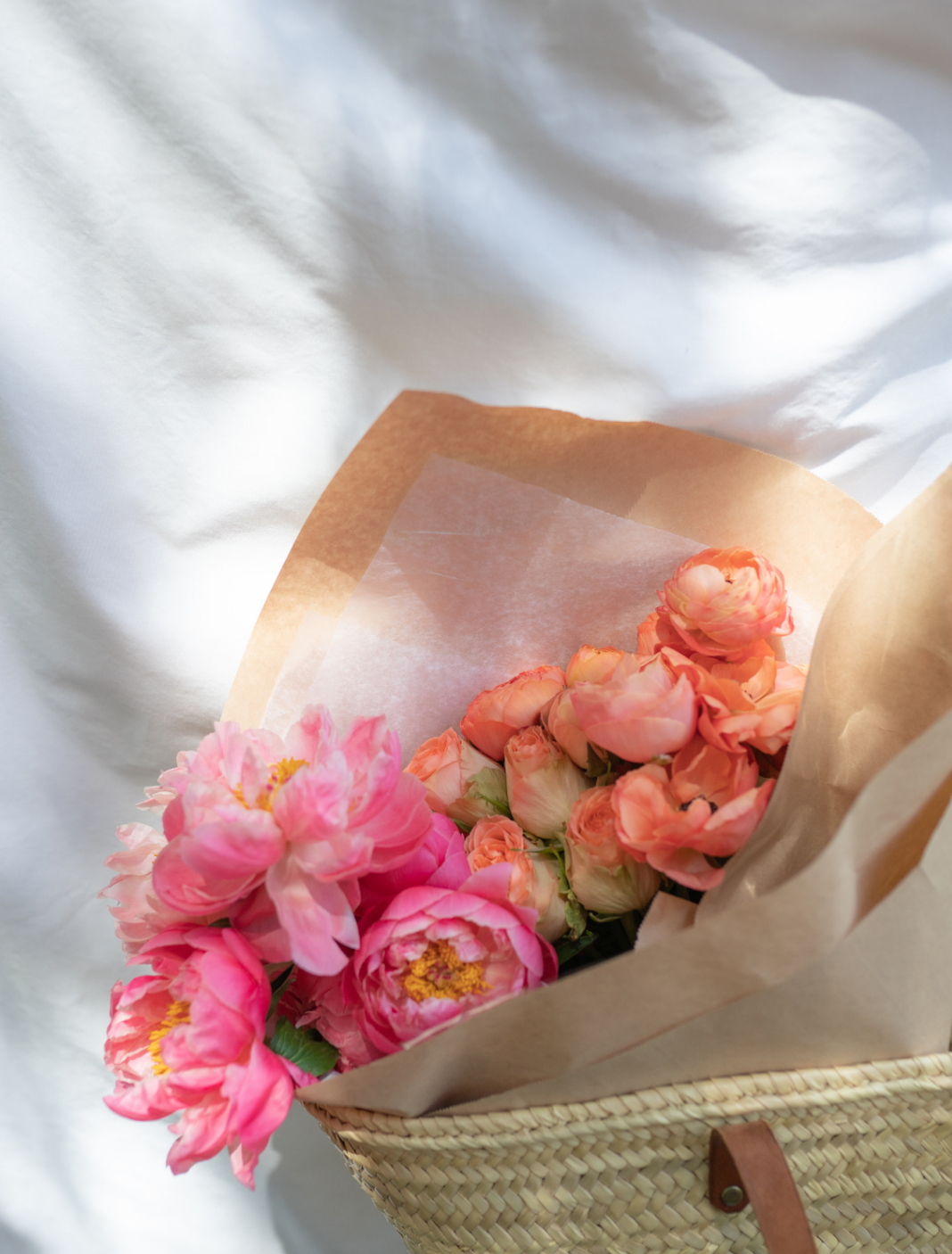
MAVI was born from the belief that celebrating life is not separate from faith, it's an extension of it. Designed for women who want their quiet moments to feel joyful, meaningful, and beautifully human, the brand invites sacred reflection to coexist with softness, playfulness, and everyday delight. Journaling is not framed as an interruption to life, but as a continuation of the party, a space where prayer, memory, gratitude, and growth are all welcomed.
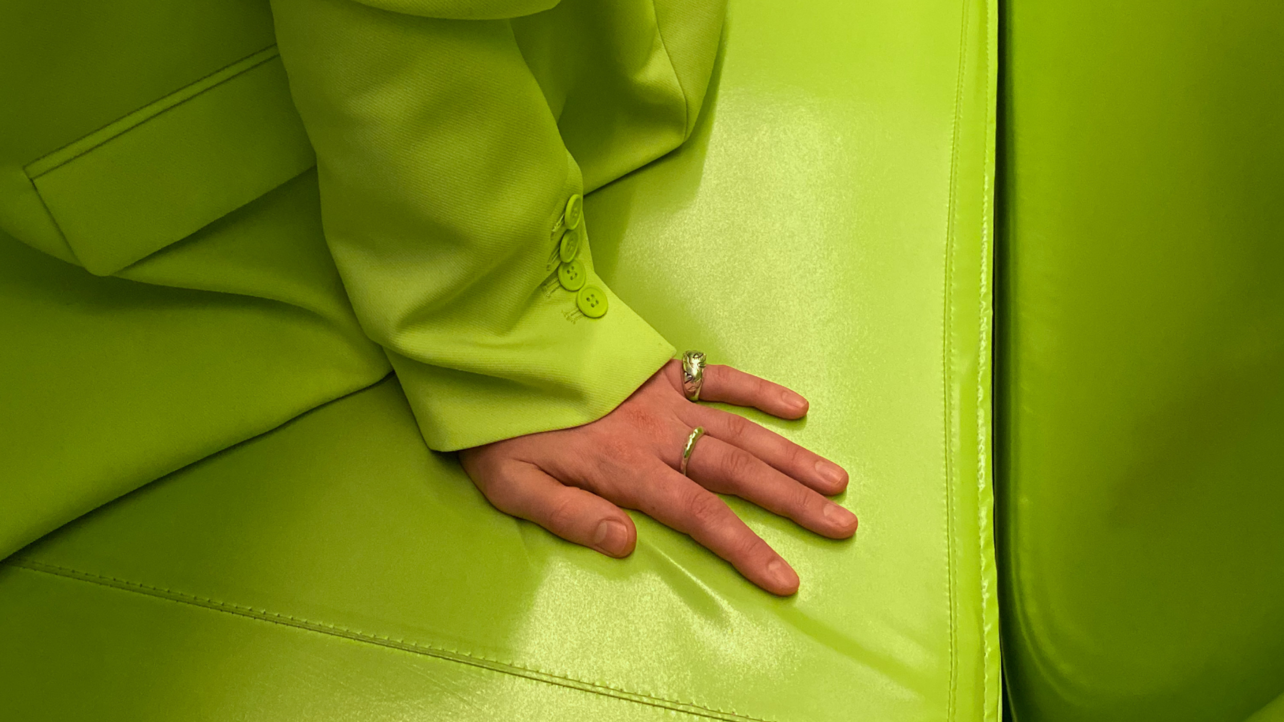
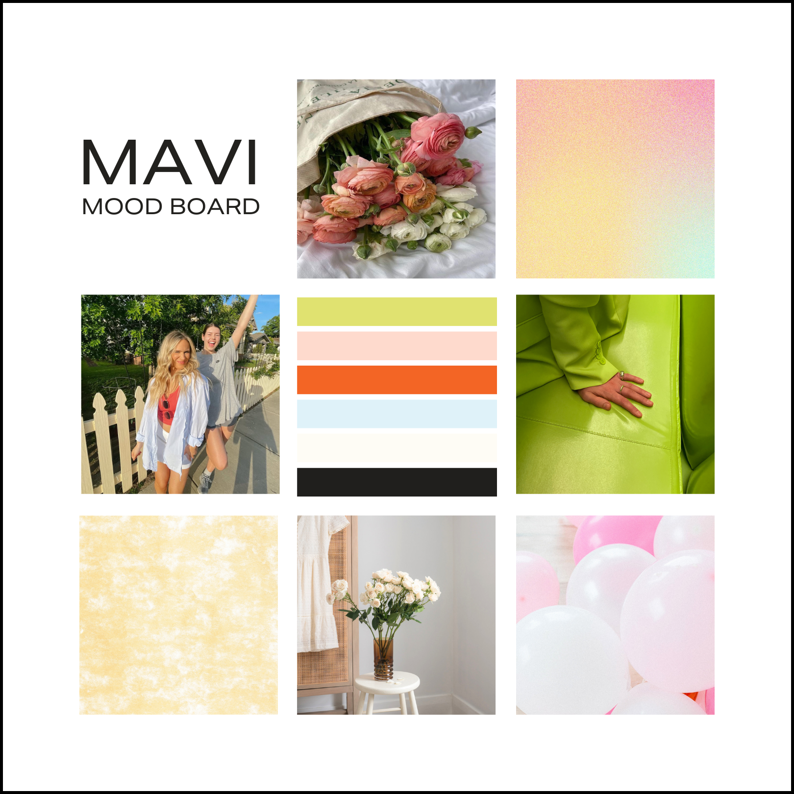
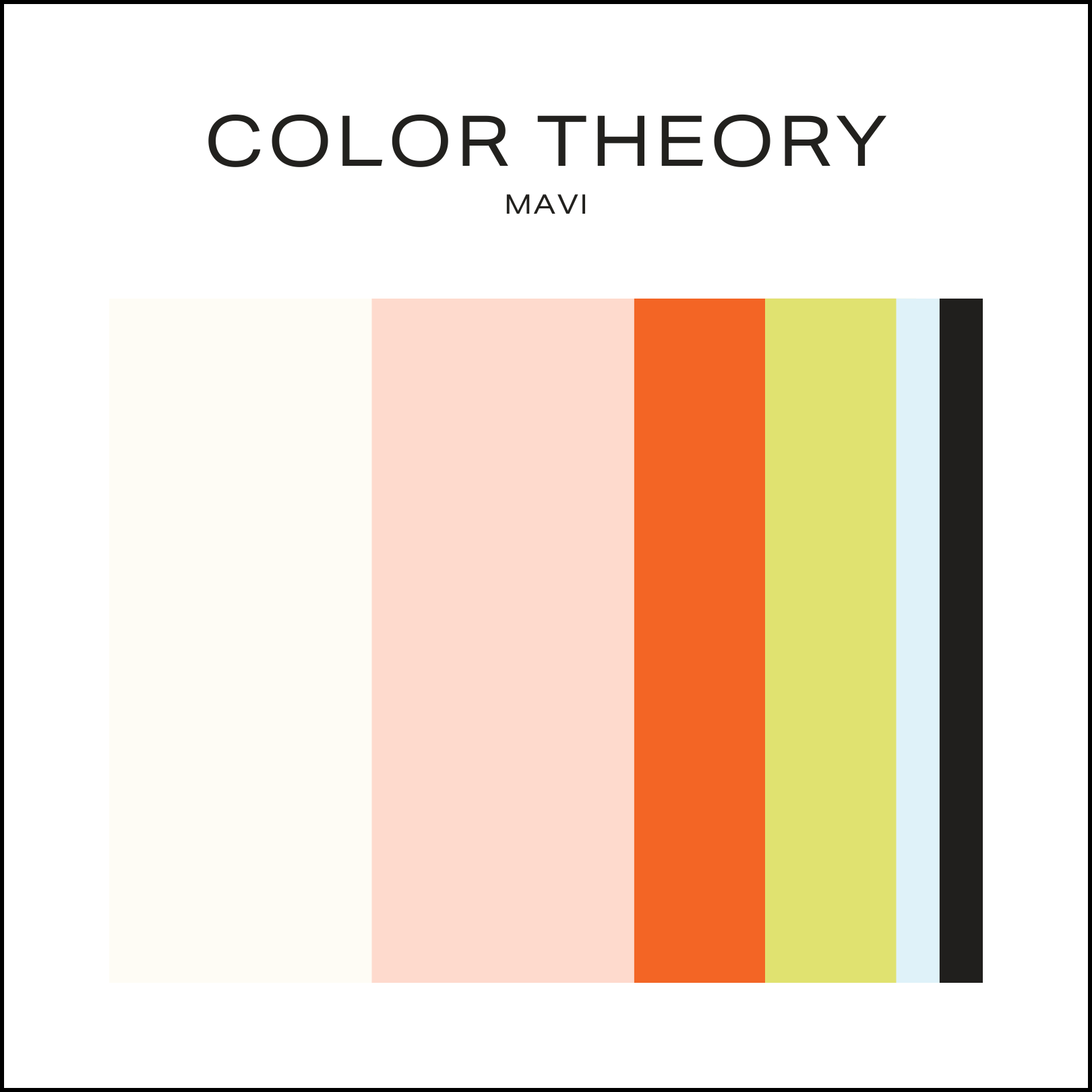
The strategy centered on balancing reverence with joy. Visually, this translated into a soft-yet-bright palette anchored by a focal hue, supported by creams, light pinks, and playful accents, intentionally free of anything harsh or heavy. Typography leans clean and condensed, with subtle expressive details and hand-drawn illustration introducing warmth and personality without overpowering the whole.
MAVI expresses confidence through thoughtful restraint, a reminder that boldness doesn't always need to be loud. Every design decision supports products that feel personal, reusable, and worthy of everyday life, honoring excellence, faith, and genuine connection through both form and function.


“Wow, I’m blown away, Aviana fully exceeded my expectations. Getting to work with her on something I care about really showed me how skilled she is. She took what I was saying, even when I couldn’t fully explain it, and literally figured out exactly what I was seeing in my head.”
Mackenzie Turner


EVERY BRAND STARTS WITH A STORY
If you’re ready to tell yours with clarity and intention, let’s begin.